Styles
Styles is where we can make and implement subtle design choices into your forms. Examples would include putting a logo or image above the form, or changing the color of the form fields or button.
All forms are responsive, that means no matter what device a person is viewing the form on, it displays nicely for them to fill out.
The options you have for styles are many:
- Give the style a name
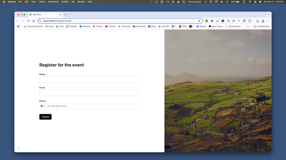
- Choose between default layout and 60/40 split layout
- Change the colors:
- Background — background of the entire form page
- Text — the labels above forms, the help text you add, etc.
- Form background — background of just the form element, not the entire page
- Field background
- Field text — the text inside of form fields
- Field border
- Field border (focus) — whether the color changes when the person's cursor is in the field
- Button background
- Button text
- Button background (hover) — when the person's mouse is hovered over the submit button
- Button text (hover)
- Error message — when the user types the wrong kind of information into a specific field
To make it easy for users to quickly get through your form, I usually recommend only the slightest tweaks. For instance, adding a relevant image if you're using the 60/40 split layout and/or changing the color of your form buttons, and that's it.
Here's a simple example of a 60/40 layout form with default colors applied:


